Dental EHR redesign: streamlined appointment checking and history records.


My Contribution
1. Conducted heuristic evaluations and stakeholder interviews to enhance usability and gather feedback on previous design iterations.
2. Designed and iterated a digital platform to streamline diagnosis and documentation management.
2. Designed and iterated a digital platform to streamline diagnosis and documentation management.

Team
1 Product Manager
1 Product Designer
1 Market Researcher
1 Product Designer
1 Market Researcher
Impact
Designed a new modern dental clinic EHR system that helped the client secure third place in the Google Startup Hub Pitch competition.
Jan - Apr 2021
Design modern EHR platform to replace outdated system.
context
Building a smarter EHR system for dental clinics.
After launching the first-generation design, E-dent continues refining the platform to better meet clinics’ evolving needs and drive greater efficiency and profitability.

Core feature on mobile, limited by screen.
Current key features are mobile-designed, offering dentists access to essential information with serveral taps.

Current web interface, an unutilized display portal
The current web version displays the same information but utilizes a more expansive layout to accommodate screen dimensions.

Merge the old design, bring more possibilities
E-dent streamlines outdated dental clinic systems with a SaaS platform that simplifies operations, digitizes medical reports, and enhances diagnosis.

Usability tests and interviews to understand the problem
Research
User's reaction to initial features
We conducted a usability test to evaluate user perceptions of key mobile features. Users favored appointment scheduling and report generation, while the mailbox saw limited use and the community feature was generally disliked.

In-depth interview with doctors to understand their unmet needs.
To uncover feature opportunities, we observed and interviewed users about their workflows. Using affinity mapping and user journey analysis, we mapped how users interact with diagnoses and reports


Strucutre the new user flow and layout of the platform.
ideation
3 Key features in new flow
Report History: Mobile limits history checks—now expanding to web.
More Information: The report should be informative and easily shareable across clinic departments.
Direct Message: Replace complex emails and forums with simple, direct messaging.
More Information: The report should be informative and easily shareable across clinic departments.
Direct Message: Replace complex emails and forums with simple, direct messaging.

Restructure the layout
We restructured the original three-column layout into a new design featuring a top information bar and left-side navigation, integrating the three columns into the main body area.

Glimpse of low-fi design
Leveraging the core features of the appointment and diagnosis reports, we redesigned the layout to optimize the use of the main body area.

First design iteration to integrate critical features.
work in progress
Dashboard
It highlights the next patient along with their medical report for quick access, and includes a weekly navigator to help dentists easily browse their full schedule.


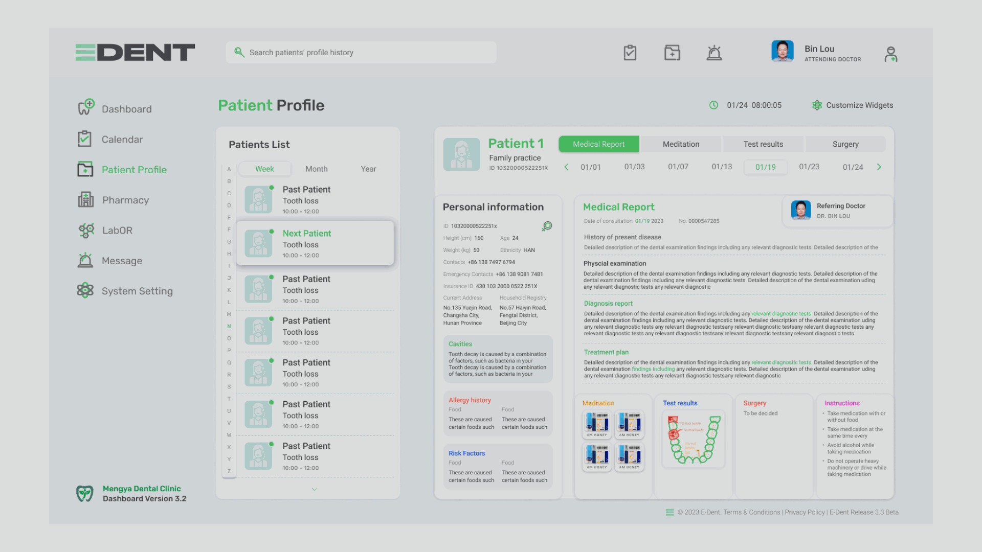
Holistic Report
Chronological tabs switch between current and past records, personas add diagnostic context, and thumbnails offer quick overviews of prescriptions and test results.
Pharmacy Prescription Sync
The medicine combination and plan you designed in the pharmacy page will sync with the patient’s medical record.

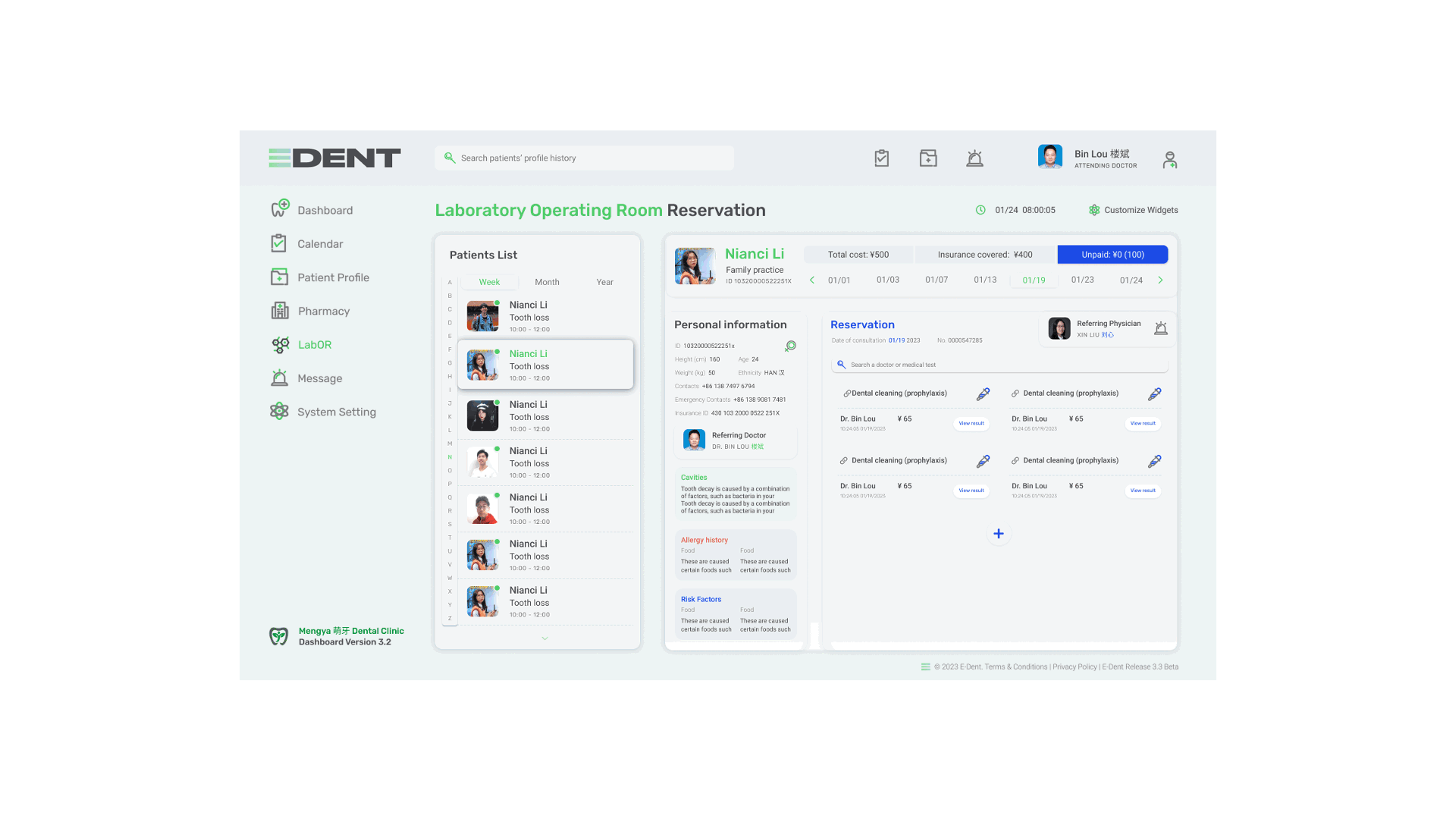
Lab Test Results
Selecting a completed test allows you to review the results. Enhanced with additional infographics, this feature aids dentists in pinpointing and elucidating dental issues more effectively.
Direct Messaging
Easily connect with patients, physicians, and technicians via the navigator and share reports with greater simplicity.

Second interation based on client's feedback.
iteration
Simplified Navigation
Based on feedback, we replaced the left nav with tabs for clearer access to key features. Records are now centered, with the appointment list fixed for quick access. A new notification area helps users easily catch important updates.
Optimized Report
We integrated a patient list with a dropdown into the record view, reducing clicks when switching between records. The persona section now combines name, photo, and details into a unified card for consistency. The overall layout has been optimized for smoother navigation.

Final Design Delivery
final design
Key interfaces

Functionality modules

Iteration process
