AI-powered financial exiting: Zolidar planner with Co-pilot


My Contribution
1. Established the foundational structure of the application, defined product branding direction, and developed information architecture.
2. Redesigned the onboarding featuring the Day Zero Survey and implemented a preliminary Aha! assessment system with seamless AI co-pilot integration.
2. Redesigned the onboarding featuring the Day Zero Survey and implemented a preliminary Aha! assessment system with seamless AI co-pilot integration.

Team
C-Suite
1 Product Designer
4 Engineers
1 Domain Expert
1 Product Designer
4 Engineers
1 Domain Expert
Impact
Reduced financial planning time by 80%. Increased efficiency and satisfaction by 23% with AI-driven guidance.
Oct 2023 - Apr 2024
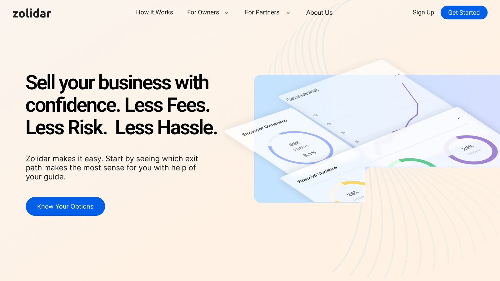
Zolidar is the easy button for employee ownership transition.
Zolidar helps business owners achieve a successful exit that secures the continuity of the business and builds a wealth of employees.
My involvement with Zolidar began at early stage, where I was entrusted with the critical task of developing the foundational web app structure with criticla features: survey & assessment.
My involvement with Zolidar began at early stage, where I was entrusted with the critical task of developing the foundational web app structure with criticla features: survey & assessment.
Current paradigm
Currently, SMB owners face high costs and long turnaround times when going through preliminary financial analysis with domain experts.

Zolidar's vision
Zolidar aims to democratize preliminary financial analysis for SMB owners through affordable expenses, easy-to-read reports, and faster turnaround times.

Launched the new MVP in upcoming Q2.
goal
Zolidar is poised to launch pivotal features such as the Day Zero Survey and Aha Assessment as part of its MVP in the upcoming spring. All the features have a rough UX framework and established product requirements, this time we need to improve the user experience and ensure the engineering team implements them well.
Initial Framework
Launched Product
Build the UI skeleton based on Berry UI framework.
Responsiveness
Utilized the Berry UI to align the front-end development.
The key breakpoints are 1440px, 1080px and 768px. We follow these breakpoints to define our app space with a collapsible menu and design different layout for the copilot
Low-Fi Breakpoints
High-Fi User Interfaces
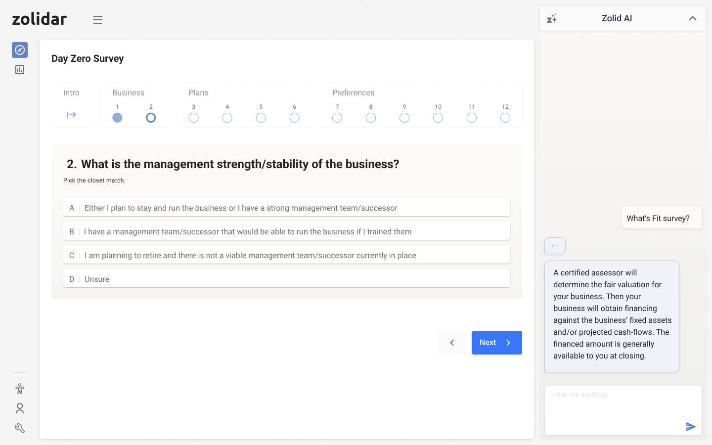
Onboarding survey with refreshed question card.
day zero survey
Prominent question card with clear states indication.
Based on the defined IA, we redesigned the survey, making the question card more prominent, the call to action more clear, and adding more interactive states for buttons and indicators.
Old Survey Design
Progress indicator draws more attention than question card itself while the call-to-action buttons placement were not ergonomic.

New Survey Question Card
Gradient background separates the question card from the whole interfaces. Reasonable font sizing and color pairing make the information hierachy clear.
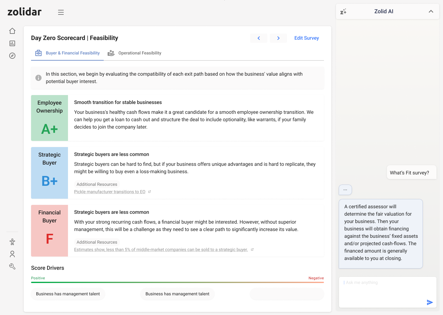
Scorecard report with clear color grading.
day zero scorecard
New quickstart summary, clearer navigation menu and much better readability.
We tweaked the navigation of the report, making the visual hierarchy clearer. We also added an intro guide and edit survey functions to complement the whole report reading experience.
Old Scorecard
Navigation panel took unnecssary real estate of the screen, key information were not differentiated in the design.

New Scorecard
Emphasizes grade and role; added before-next button, tabs and nested side menu for better navigation.
Exploration of different data visualization method of report summary
We first tested Heatmaps, Bar Charts, Radar Charts and Line Charts to see which would be easier for a user to digest quickly. Then based on the bar charts, we tried to stack bar charts and utilize the Gantt Charts.

Final Visualization
For the final version,We iterated the Stacked Column Chart.

Preliminary assessment with expert-Level reporting.
AHa! Planner
The key to replace excel sheet: smooth data input experience.
Following the survey redesign strategy, we clarified the input area statuses and made the visuals cleaner and less cluttered.
Redesigned valuation report to improve readability.
The original report design was a cluttered stack of information. We collaborated closely with domain experts to demystify the financial data and make it easily digestible for small business owners.
Breakdown the information then design layout accordingly.
The original report was dense and text-heavy, resembling a raw "Google Doc" feeling. Partnering with a financial expert, we divided the content into five key sections, then redesigned the layout with clear data visualizations and hierarchy to make the information easy to navigate and absorb.
Format information

Use color to properly highlight

Use icon and diagram
New KPI metrics help visualize your business exit options.
We also redesigned another crucial part: KPI, which reflects every aspects of the status of business and helps understand future exit options.
Old KPI Metrics
Original axis design cannot communicate the trend at a glance.

New KPI Metrics
Changed the axis into a line chart to better highlight the trend and KPIs.

New KPIs Summary
We executed the similar data visualization of all KPIs' summary .

Conversational AI to handle Q&A and surface helpful resources.
AI Copilot
Auto-suggestions and collect feedback from users.

Responsive design to maximize the conversation.
Adds additional insight to your scorecard & assessment.
The Zolidar* icon represents AI insights, when click on it, it will promptly generate potential questions you may want to ask so it help you better understand the section you're reading.
Provides and summarizes online resources links.
The AI will find relevant resources help explain your scorecard and attach to it. When click on the link, it will provide a short summary as well.
Quick brand refresh for better customer alignment
rebrand
Associate trust with the new visual direction.
The original brand palette, anchored in purple, lacked complementary colors, limiting the versatility of our visual identity.

Old 'purple' guideline
Purple's modern vibe is potentially misaligned with our core demographic of senior business owners.

New 'trust worthy' guideline
Our goal is to build trust into our branding, crafting a more inviting and relatable aesthetic that resonates with our audience's expectations.

More sacrificed branding direction concepts